Brief: PlantMe is an innovative discovery platform where gardening specialists and individuals connect in order to conduct business. Through the service, users can arrange gardening services, primarily landscaping and maintenance work, or list their work for booking. PlantMe profits by receiving commission from each booking.
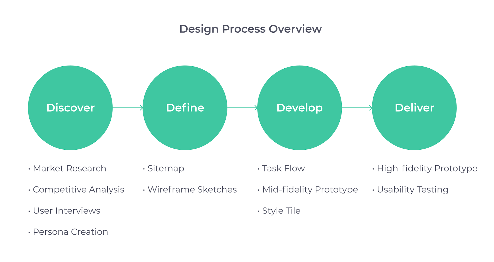
Goal
1. Create a native app for both android and iOS that allows contractors to showcase their services.
2. Enable search for services using filters such as landscaping type, dates, location, and price, and search for specific types of landscaping, such as maintenance, mowing, and pest control.
3. Design a review-based system where clients and contractors have the ability to rate the experience.
Market Research
Beginning with market research, I spent some time familiarizing myself with the landscaping industry. I wanted to learn more what kind of market PlantMe would become involved in. Here were some interesting findings:
• The landscaping industry generates $93 billion in annual revenues.
• Employs more than 1 million people annually.
• Has an annual growth rate of 3.5%.
• Consists of nearly 500,000 businesses.
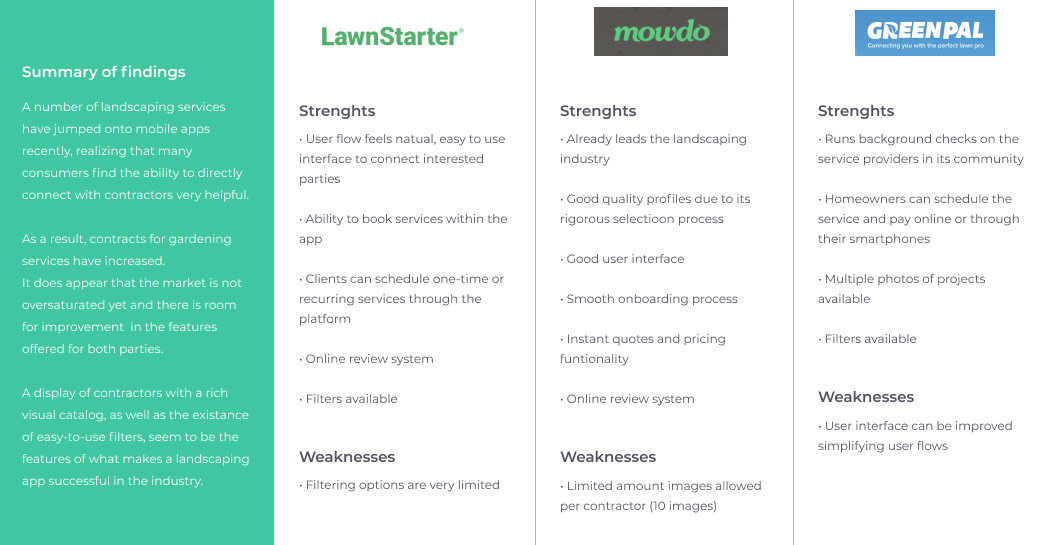
Competitive Analysis
To get a better understanding of the competitors, I performed competitive analysis by downloading 3 landscaping apps that offered similar functionalities to identify their strengths and weaknesses.
This allowed me to learn how other apps approached connecting customers with contractors, and what opportunities were available for PlantMe to distinguish itself.
User Interviews and Persona Creation
To better understand the members of the community, I conducted my own research by creating an interview guide to use during 1-on-1 interviews, focusing on user needs. I conducted 3 interviews, with participants of different backgrounds ranging in ages 28-36. Two of the participants had experience as contractors in the landscaping industry and one of them was a potential customer for the end product.
Based on their feedback, I created personas such as the ones shown below:
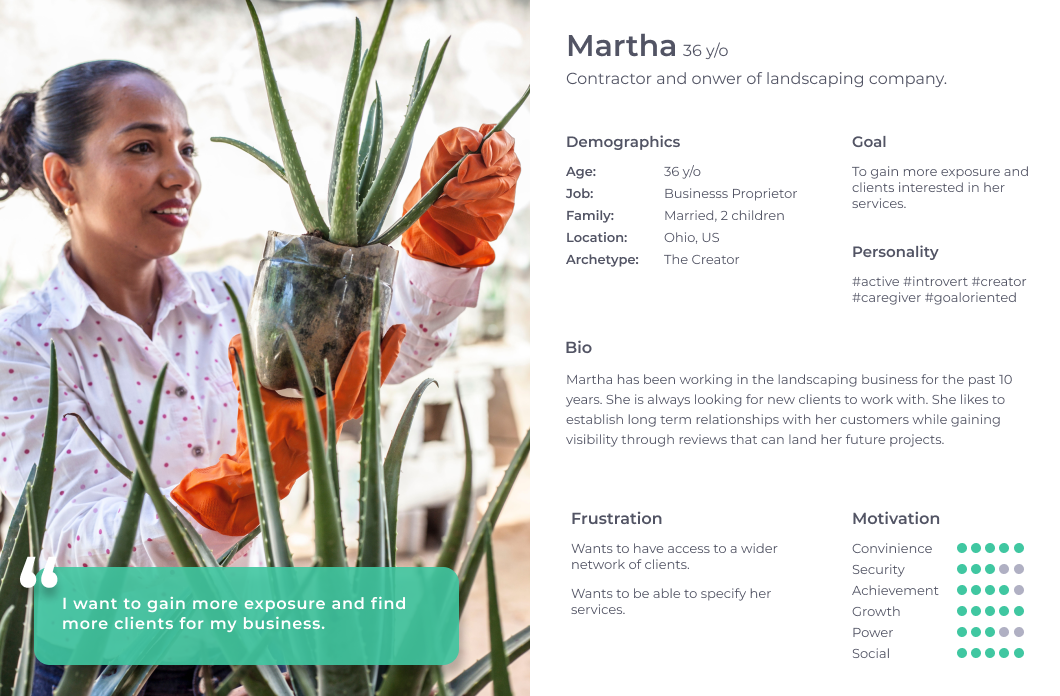
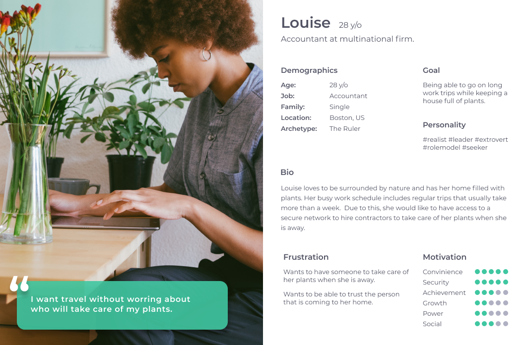
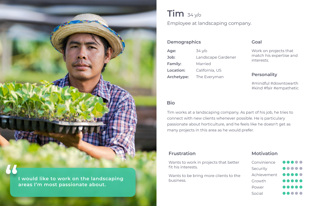
The creation of these personas helped me to understand the users' needs, experiences, behaviors and goals. It also helped me to identify the users I was designing for and their expectations.
Understanding the clients and their needs was the number one priority, and based on that, I needed to set the MVP of the project.
As mentioned above, the app targeted users looking to offer professional services, as well as individuals looking to fulfill tasks that they couldn't perform.
After addressing user's needs, these were the features that we decided we needed to focus on for our MVP:
• Infinite scroll gallery showcasing recently posted projects.
• Screen were users can connect with contractors/clients.
• Review based system visible on contractors and clients profiles.
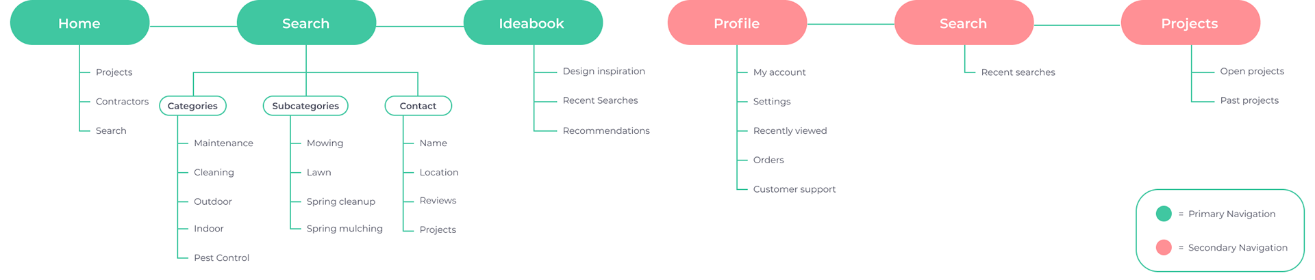
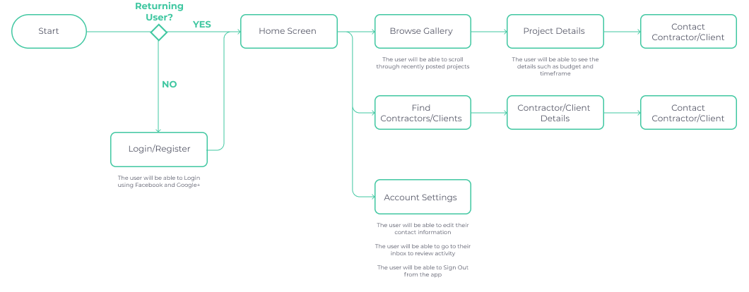
Sitemap
I wanted to keep the sections of the app organized neatly and easy to navigate for the user.
Noticing how other landscaping design apps were structured, I created the primary navigation with three sections that included a Home, where users could see latest projects posted around the area, contractors, and a basic search form; a dedicated Search screen with tailored filters; and an Ideabook where users could save projects they liked or services they were interested in. I also created a secondary navigation with user details and a contact feature.
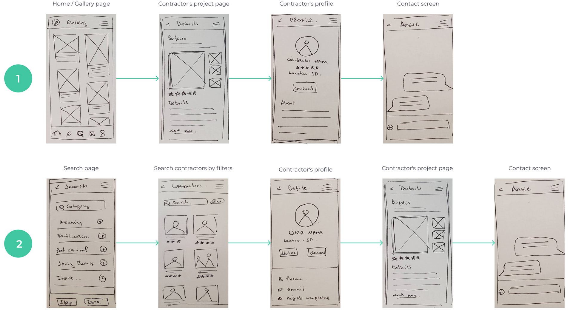
Wireframe Sketches
I created 2 flows:
The first flow followed a user going through the image gallery through the infinite scroll, clicking on a project to learn details, going to the user's profile screen, and contacting the contractor or client involved in the project.
The second flow was a search oriented journey with filters that allowed clients to locate contractors that had experience in the selected categories, then displaying these results, going through the contractor's page, and learning more about previous projects were they were involved. From there, the user could decide if they wanted to connect with the other party to start the dialogue.
Task Flow
I created 2 task flows in order to focus on what I wanted the users to accomplish in my MVP:
• User view latest projects posted around the area.
• User finds contractor through the search by filters functionality.
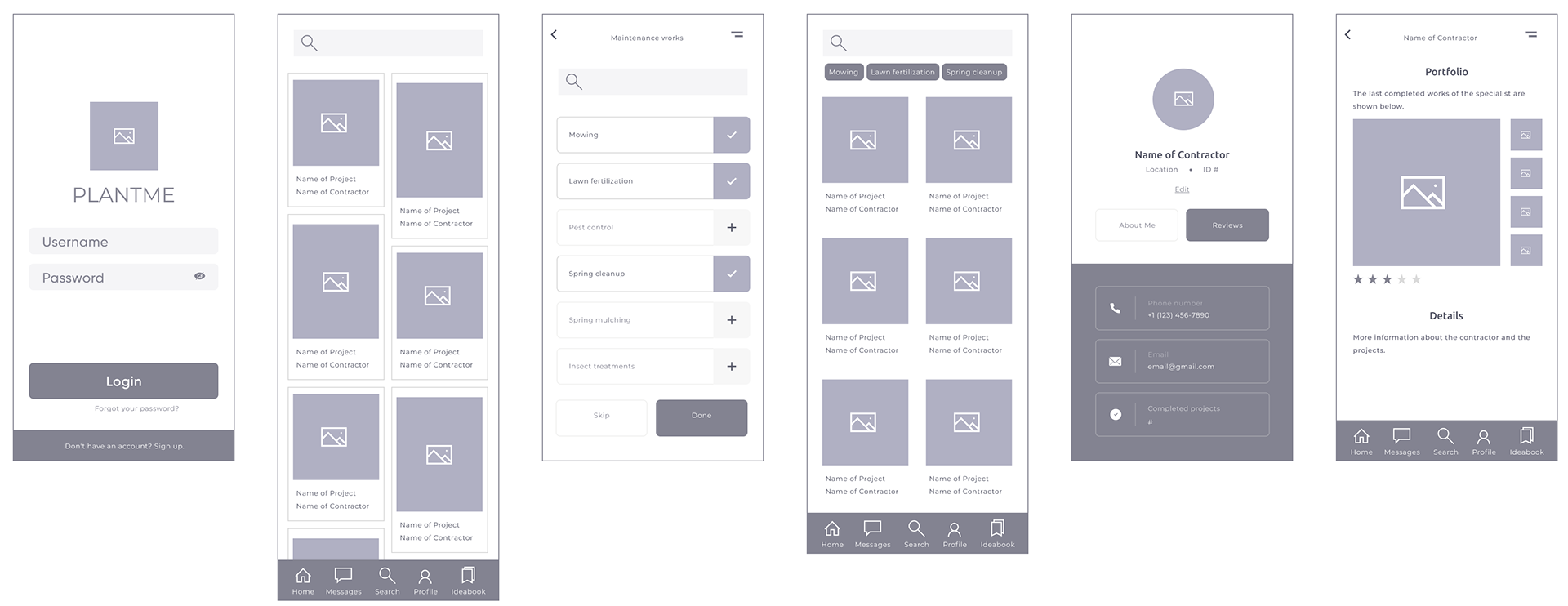
Mid-Fidelity Prototype
I created mid-fidelity prototypes in Figma. After logging in, users navigated to the homepage where they could view recent projects or search specific ones by using the filtering tool. While gathering feedback from the prototypes, we realized that it would be more convenient for the user to directly access the message feature and the account details from the primary navigation bar.
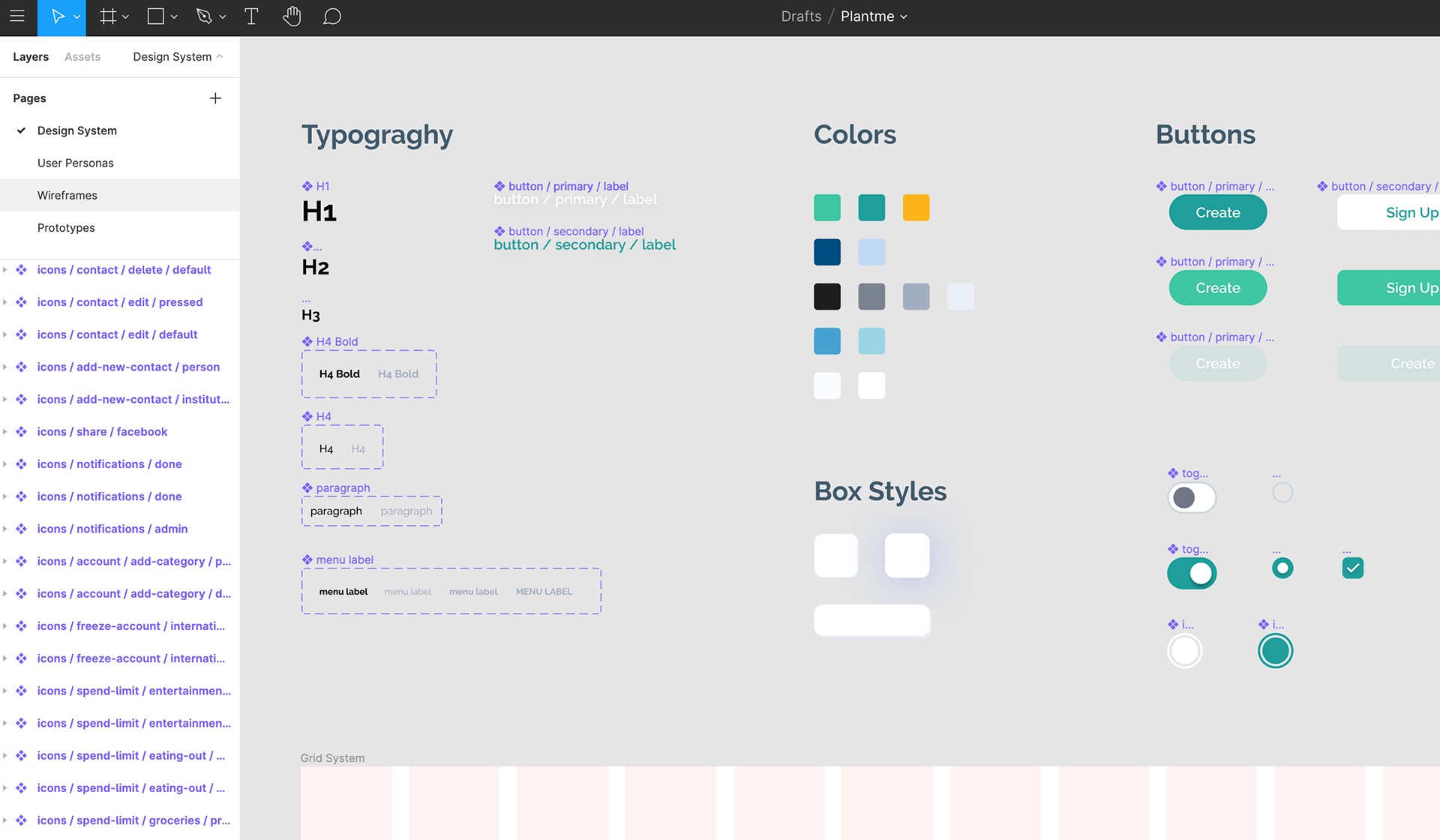
Style Tile Development
Once I had the product direction defined, a cardinal step was coming up with a design system that allowed scalability. This was necessary to make sure the product run straight on the line and had a good foundation. That way, when the time to add new features, screens, or modals came to be, it wouldn't be any major alteration or questions about how to proceed.
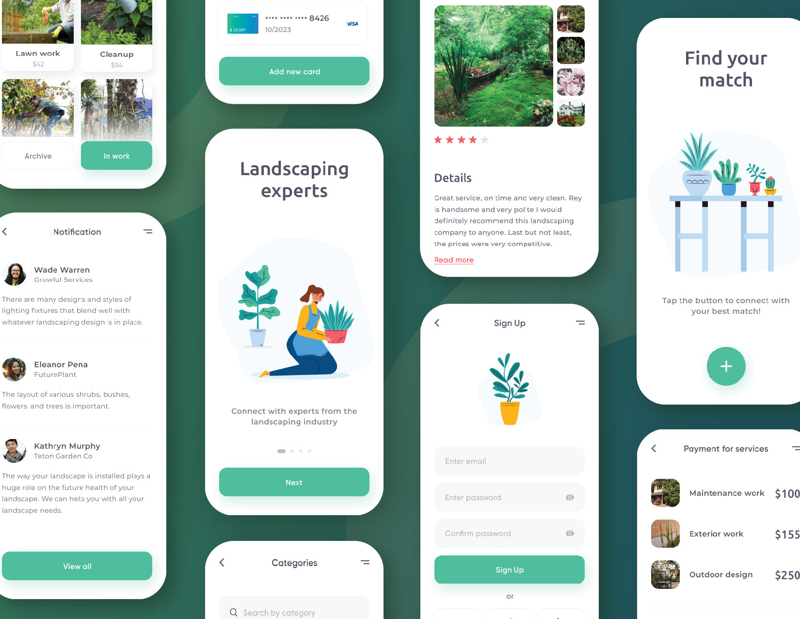
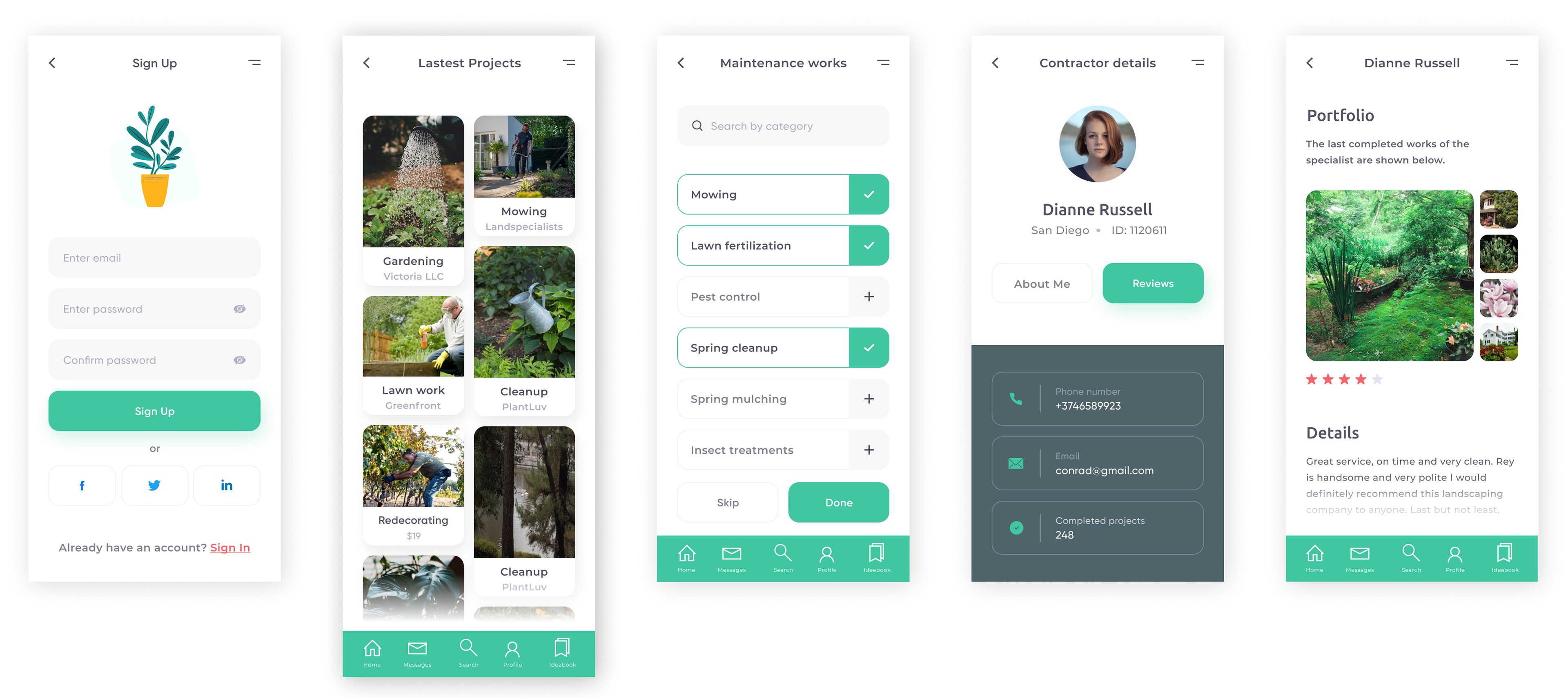
High-Fidelity Prototype | Usability Testing
I created a high-fidelity prototypes in order to for users to easily visualize the MVP during usability testing.
Usability Testing
I tested my hi-fidelity prototype with a total of 4 people using Figma Mirror.
Most user’s feedback was positive, and everyone was able to navigate the task flows successfully.
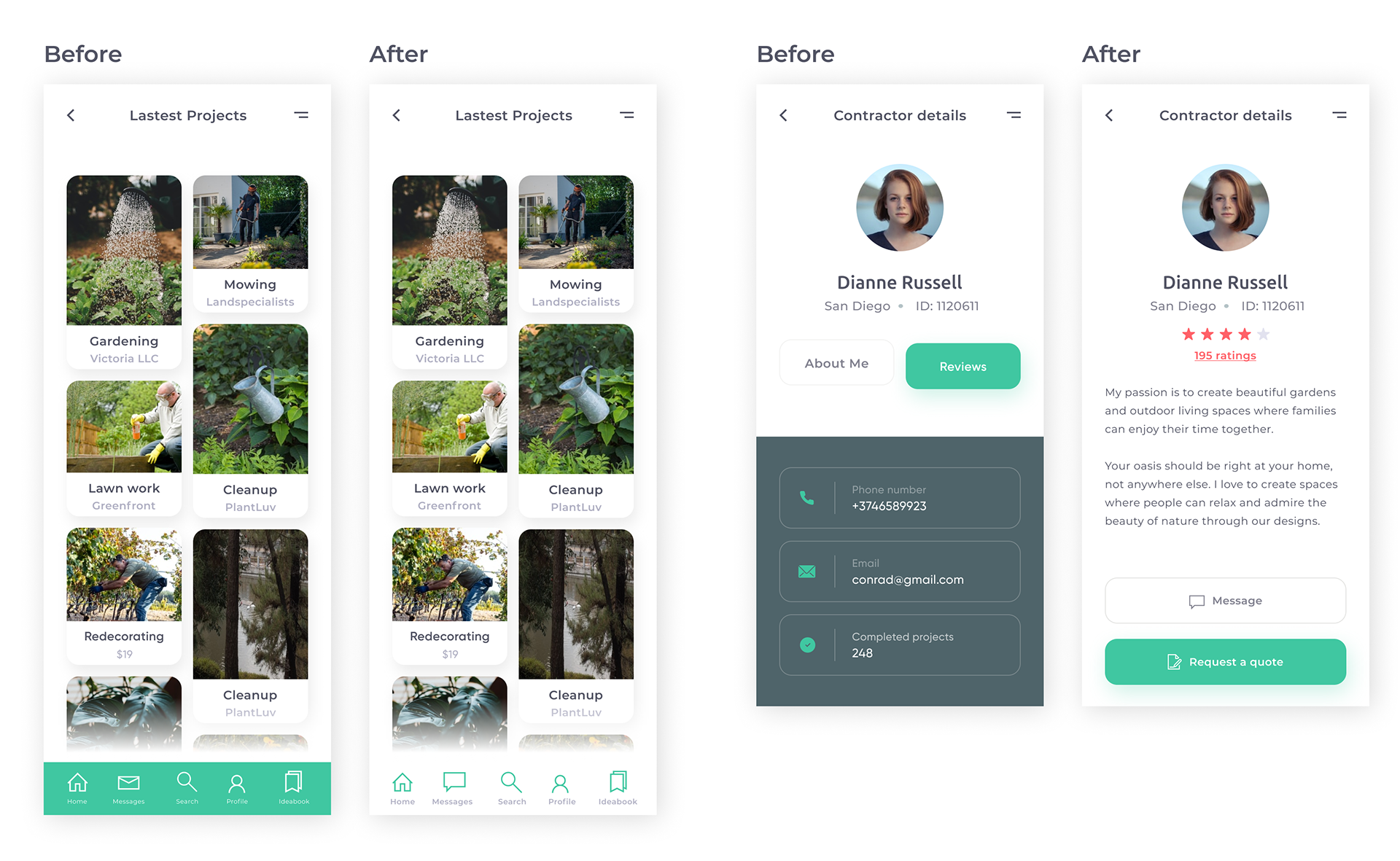
Most of the feedback was focused on UI elements, such as the navigation bar color, text weight and size, and selection of icons.
The page that needed the most revision was the "Contractor Details" screen, where the users preferred seeing the overall ranking of the contractor. The “About me” was resolved displaying the information on the same page. I also changed the call to actions to a direct "Message"button and a "Request a quote", as they preferred to directly connect through the app if possible.
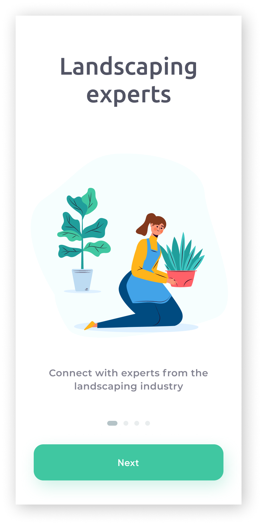
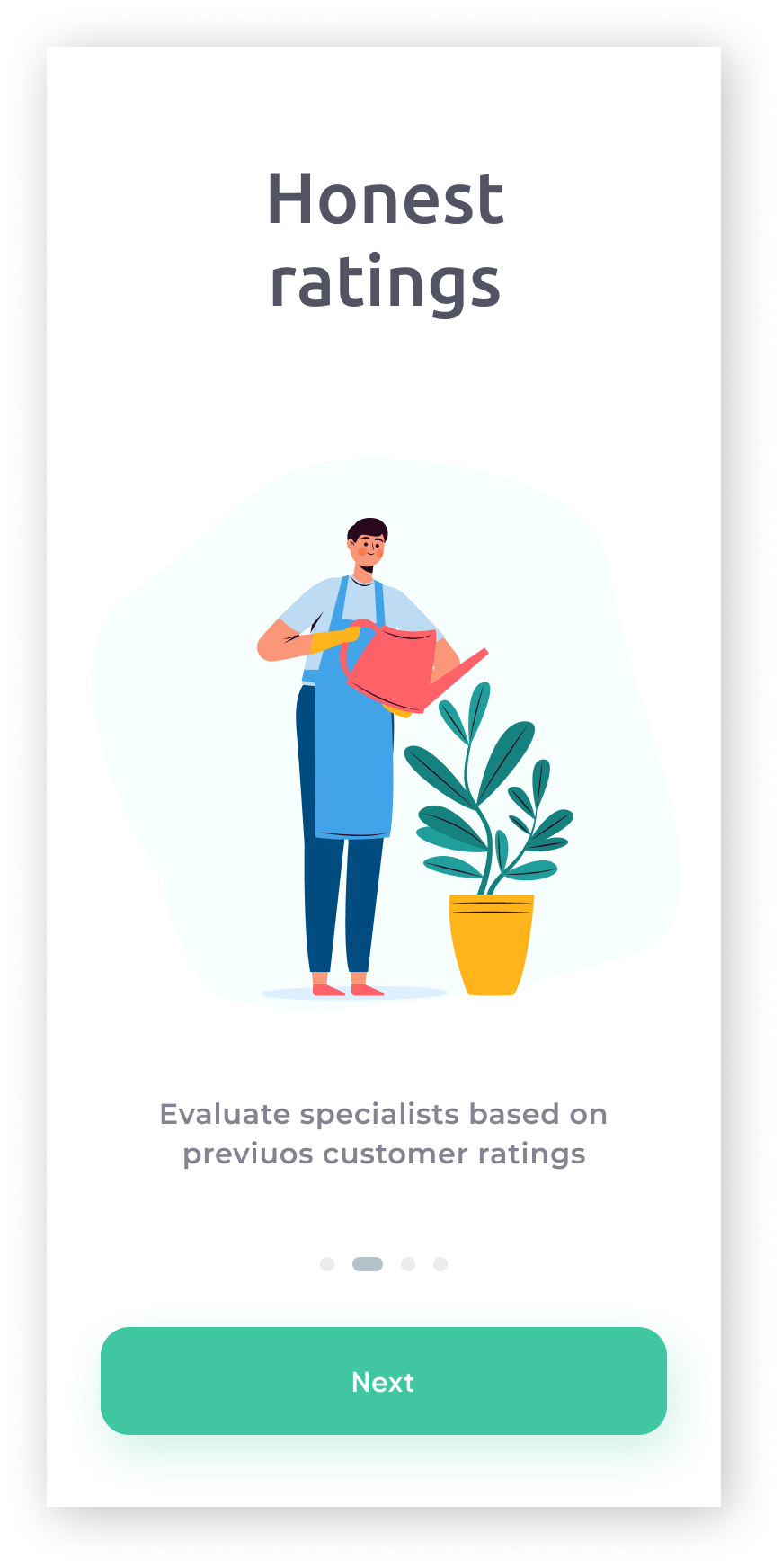
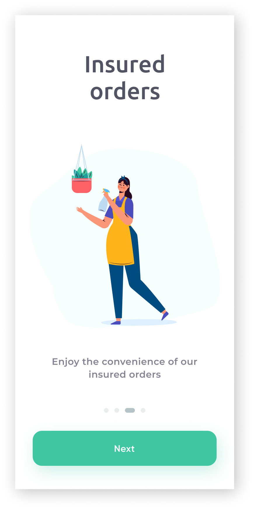
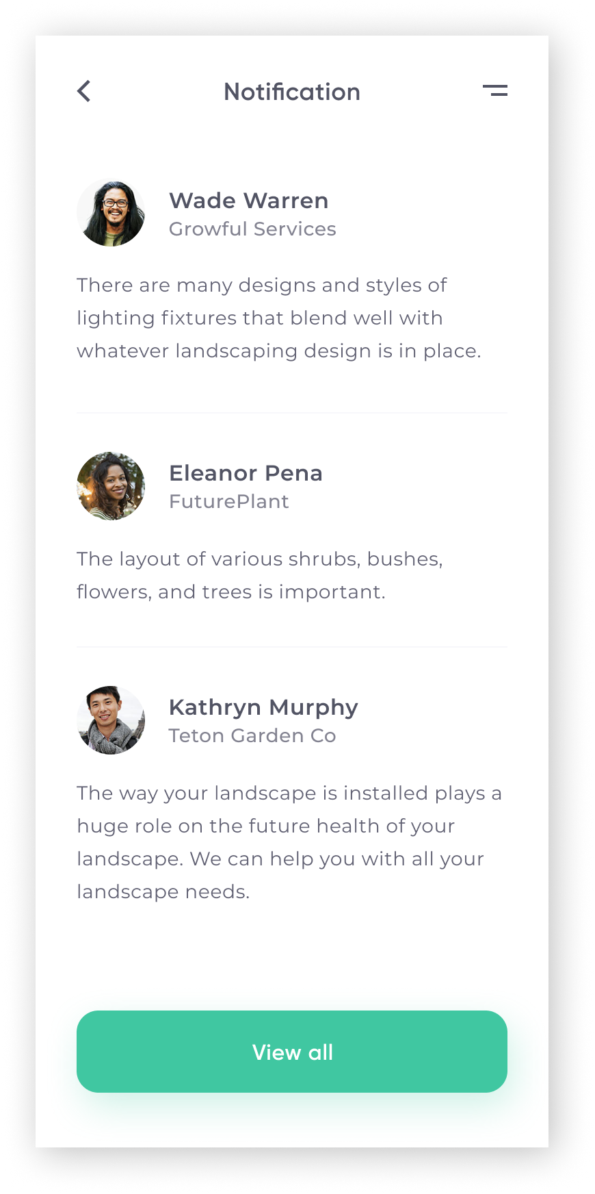
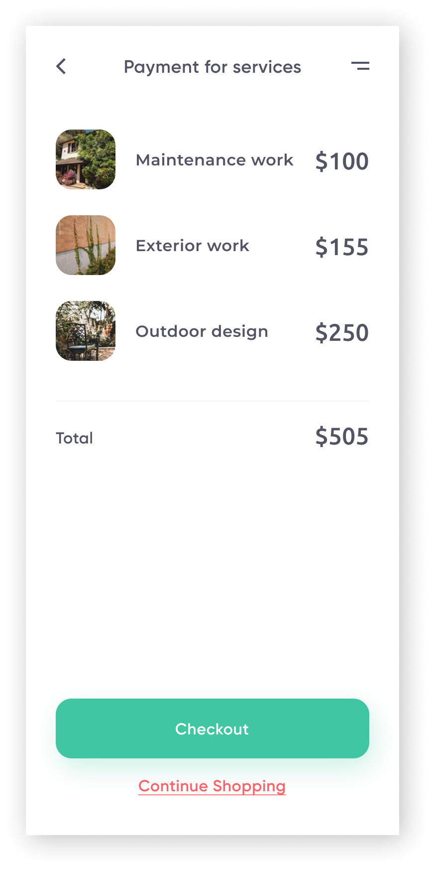
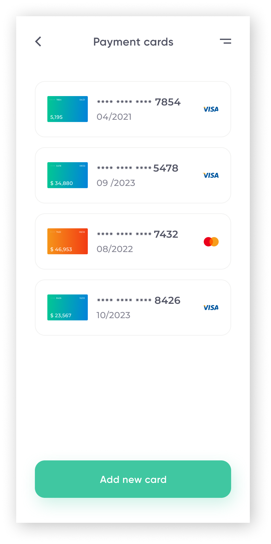
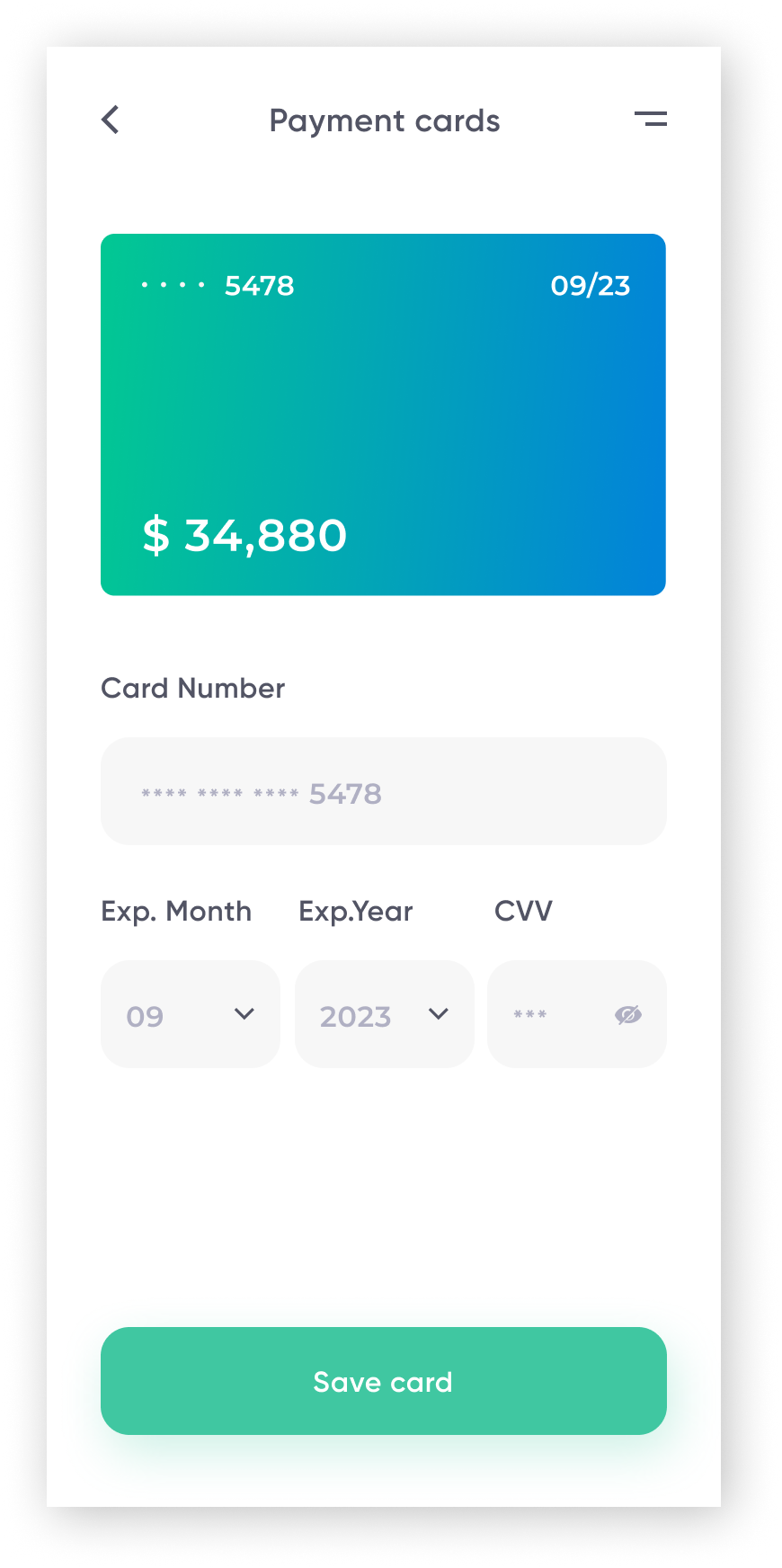
Other Screens Developed
As the project moved forward I worked on the onboarding screens and the check out flow. I have included below some of these screens.

Takeaways
Users find the concept of hiring through a 3rd party service that does all the background check beforehand a useful tool.
More usability testing is needed, especially with users who are experienced booking services through an app.
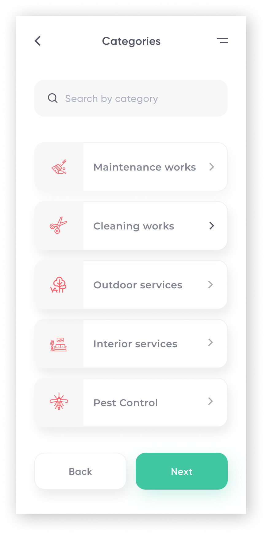
The app needs to expand its categorization system, which will enable users to find the best fit for their needs more efficiently.
. . .